ANKA (formerly Afrikrea)
User Experience Designer
2021
Anka Shipping: Fixing the $30 Promise
Cross-Cultural E-commerce Platform
Site: https://www.anka.africa/
Highlights: 20% reduction in shipping overcharges • $15M GMV growth ($35M→$50M) • 30% faster seller onboarding • 60% retention improvement • 20,000+ merchants enabled
Highlights: 20% reduction in shipping overcharges • $15M GMV growth ($35M→$50M) • 30% faster seller onboarding • 60% retention improvement • 20,000+ merchants enabled
Before → After: Long, error-prone forms → Multi-step, validated flow • Hidden customs fees → 3 transparent duty options • 20% overcharges → Accurate volumetric pricing • Complex shipping → <$30 to 175 countries in 72 hours

The Challenge
In early 2021, Anka (formerly Afrikrea) made a bold promise: ship from anywhere in Africa to 175 countries for under $30 in 72 hours. We partnered with DHL and Visa to turn African artisans and small businesses into global exporters.
But we had a problem threatening to break that promise.
The shipping label form—the gateway to international commerce for 20,000+ sellers across 47 countries—was bleeding money and trust. 20% of sellers were being overcharged because our form didn't capture volumetric weight correctly. Sellers would fill out the long form, ship their packages, then get hit with surprise charges days later.
Worse, customs fees were a black box. Sellers shipping to Europe or the US had no idea who would pay duties or how much they'd cost. Packages would get held at customs, buyers would refuse to pay surprise fees, and shipments would be returned—wasting time, money, and relationships.
For a community where 80% of sellers are women artisans in Nigeria, Kenya, Ghana, and Ivory Coast, unexpected fees weren't just frustrating—they were deal-breakers. Every overcharge meant less profit, less trust, and one more reason to abandon cross-border selling.
My mandate: Fix the shipping experience in 8 weeks. Make it accurate, fast, and reliable.
The Real Problem: A Form Built for Computers, Not People
User research revealed the pain wasn't just about volumetric weight.
I started by talking to sellers and reviewing customer support tickets. The patterns were clear:
The shipping form was impossibly long. Sellers had to scroll endlessly on mobile, losing context of what they'd already filled in. One seller told me: "I start the form, get confused, and come back later. Sometimes I forget if I already added the dimensions."
Errors were a nightmare to fix. If you made a mistake on field 8, you had to scroll back up through 15+ fields to correct it. On mobile, this was excruciating.
Customs was terrifying. Sellers didn't understand Delivered Duty Paid vs. Delivered Duty Unpaid. They'd ship packages, then discover their buyers refused to pay €50 in customs fees. The package would return to Africa, costing everyone.
Finding a previous label was like searching in a junk drawer. Sellers who shipped regularly couldn't quickly locate past labels to reuse information or track packages. Customer support was flooded with "I can't find my label" tickets.
And the killer issue: no one understood volumetric weight. The form asked for package dimensions but didn't calculate volumetric weight or explain why it mattered. DHL would recalculate on their end, discover the actual cost was higher, and charge the difference. Sellers felt blindsided.
The insight hit me: We weren't just designing a form. We were designing trust in a $30 promise.
Breaking the Form into Breathable Steps


Clarity through progressive disclosure
I sketched dozens of iterations on paper, testing different approaches: single page with sections, accordion menus, wizards. The breakthrough came when I stopped thinking about "a form" and started thinking about "a conversation."
What if we broke the shipping process into distinct steps—package details, sender info, recipient info, customs, review—so sellers could focus on one thing at a time?
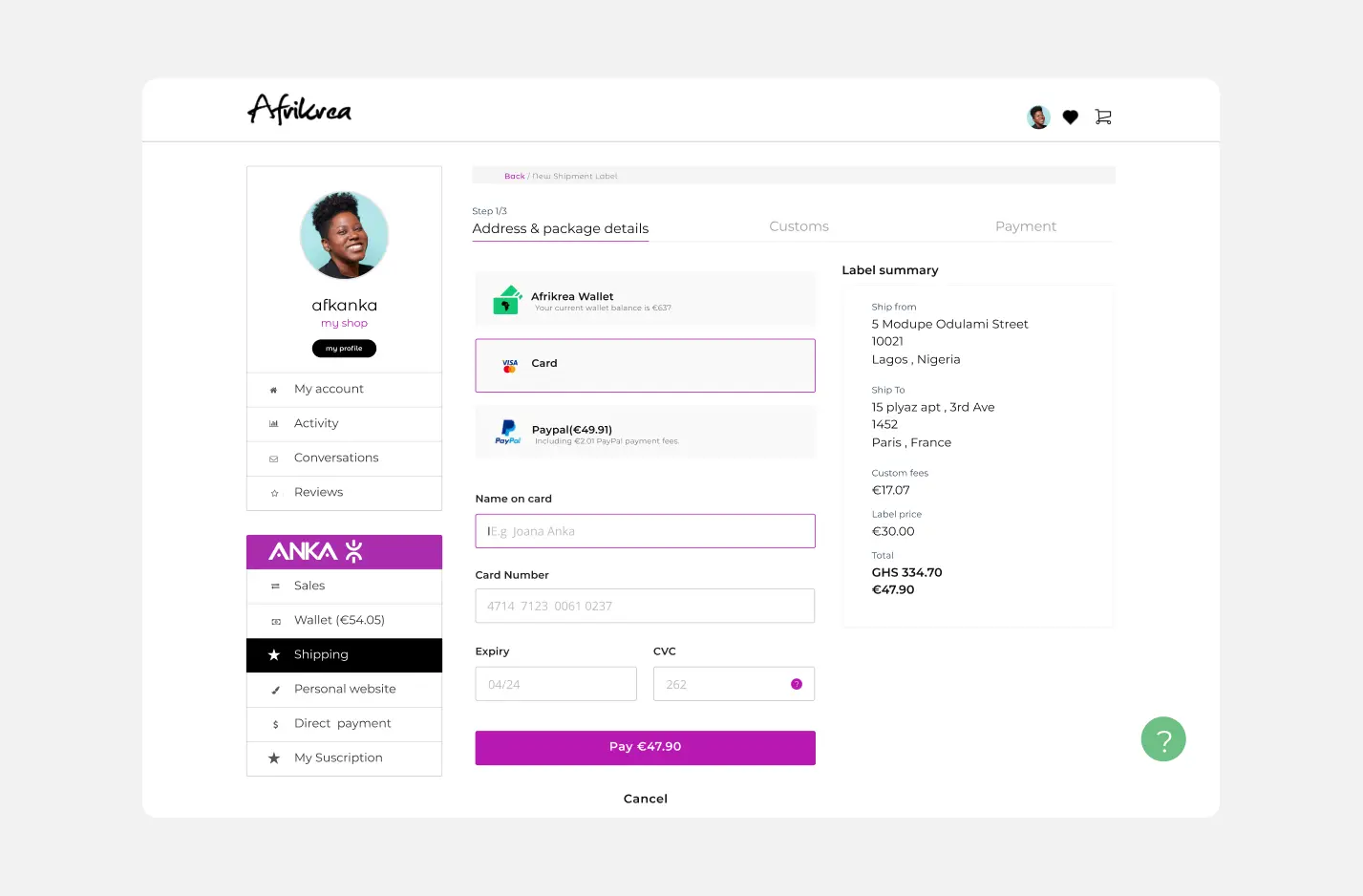
I wireframed a multi-step flow in Whimsical, then moved to Figma for higher fidelity. Each step was a separate screen with clear progress indicators. No endless scrolling. No cognitive overload.
The volumetric weight problem demanded a different solution. I added a real-time calculator that showed both actual weight and volumetric weight as sellers typed dimensions. A simple tooltip explained: "Shipping cost is based on whichever is higher."
The calculator displayed the final cost in both local currency (GHS, NGN, KES) and Euros: "The billed weight: 0.5 Kg / Your shipping will cost GHS 132.69 / €19.07" Transparent. Educational. No surprises.
For mobile, I designed the form to feel native—large touch targets, smart keyboard types (numeric for dimensions, email for addresses), and auto-advancing between fields.
Demystifying Customs with Three Clear Choices
Turning fear into informed choice
Cross-border shipping from Africa isn't just logistics—it's navigating customs bureaucracy that most sellers don't understand. A package from Lagos to Paris faces VAT, import duties, and DHL handling fees. If the buyer doesn't know about these charges upfront, they often refuse delivery.
Cross-border shipping from Africa isn't just logistics—it's navigating customs bureaucracy that most sellers don't understand. A package from Lagos to Paris faces VAT, import duties, and DHL handling fees. If the buyer doesn't know about these charges upfront, they often refuse delivery.
I designed three customs payment options that gave sellers control while educating them about trade-offs:
Option 1: "I'll take care of the fees" (Delivered Duty Paid)
The seller pays all customs fees upfront. The buyer receives the package with no surprises. Clear pricing shown: "Total Custom Fees: EUR 20.00"
When to use: High-value items where the seller wants to guarantee delivery and provide premium service.
Option 2: "Help customer pays the fees upfront (save €10)"
Anka sends a payment link to the buyer before shipping. The buyer pays customs fees directly, avoiding DHL's markup. Savings highlighted: "They will pay [amount]€ instead of [amount]€"
This option uses DHL's special pricing (€5 vs. €17 for DDP service), passing savings to the buyer.
When to use: Sellers who want to offer competitive pricing while ensuring buyers aren't surprised at delivery.
Option 3: "Let customer pays the fees on delivery" (Delivered Duty Unpaid)
The buyer pays customs fees to retrieve their package at delivery. Risk shown clearly: "Your recipient will pay up to [amount]€ in customs charges"
When to use: Low-value items or established buyer relationships where the seller wants the lowest upfront cost.
Each option included plain-language explanations, cost breakdowns, and clear consequences. No jargon. No hidden fees.
For packages over 10kg, I added a contextual warning in French and English: "Afrikrea ne prend pas en charge les taxes douanières pour les paquets de plus de 10 kg. N'hésitez pas à diviser en plusieurs petits paquets." (Afrikrea doesn't handle customs taxes for packages over 10kg. Split into multiple smaller packages.)
Making Labels Findable
Search and filters restored control
The label list page was a mess—chronological only, no search, no filters. I designed a search bar with autocomplete that let sellers find labels by recipient name, order number, or tracking ID.
The label list page was a mess—chronological only, no search, no filters. I designed a search bar with autocomplete that let sellers find labels by recipient name, order number, or tracking ID.
I added filter chips for status (Pending, Shipped, Delivered, Awaiting Customs), date ranges, and destination country. For power users shipping dozens of packages monthly, this was transformative.
I also introduced a "Change Address" feature—one tap to s


elect from saved addresses (e.g., "5 Mobolaji Odunlami Street, Lagos, Nigeria"). Small feature, huge time savings for repeat customers.
Testing with Real Sellers
Iteration revealed the details that mattered.
Working with our PM and another UX designer, we ran usability tests with sellers in Nigeria and Kenya via video calls. We watched them create labels on both mobile and desktop.
What worked:
The multi-step flow eliminated confusion. Sellers loved seeing progress.
- The volumetric weight calculator removed anxiety—they knew the final price before submitting.
- The customs options were a revelation. One seller said: "I never understood this before. Now I can explain it to my customers."
What needed fixing:
Some sellers wanted to edit previous steps without starting over. I added a "Back" button and made the progress indicators clickable.
- The address autocomplete (powered by Google Places) was buggy in some African regions. We added manual entry as a fallback and improved error messaging.
- Sellers requested confirmation before submitting—worried about making mistakes. I added a review step showing all details before final submission.
We iterated three times over two weeks, refining the flow based on real feedback.
Designing with Constraints
Reusing the design system meant shipping faster.
I worked within Anka's existing design system—components, colors, typography, spacing. This wasn't limiting; it was liberating. Engineers could implement quickly because the building blocks already existed.
I did propose two new components: an address dropdown with autocomplete and an enhanced search pattern for the label list. Both were added to the design system for future use.
The entire design lived in Figma—142 UI components documented, organized, and ready for handoff. I created prototypes for both mobile and desktop, annotated with interaction specs, validation rules, and error states.
Impact Highlights
In the first quarter after launch:
• 20% reduction in overcharges – Volumetric weight calculator eliminated surprise fees
• 60% seller retention improvement – Accurate pricing and transparent customs built trust
• $15M GMV growth ($35M→$50M) – Reliable shipping drove more cross-border sales
• 30% faster onboarding – New sellers generated their first label in minutes
• 42% payment success increase – Integrated Visa/DHL localized payment methods
• $2M+ monthly transactions – Processing shipments to 175 countries
The activation rate told the real story. Customs disputes nearly disappeared. By giving sellers three clear options with transparent costs, buyers knew what to expect. Packages stopped getting abandoned at customs.
What I Learned
Forms are conversations, not documents
The multi-step approach transformed a daunting task into a guided experience. Progressive disclosure works because it respects cognitive limits.
The multi-step approach transformed a daunting task into a guided experience. Progressive disclosure works because it respects cognitive limits.
Transparency builds trust—especially with money
Showing the volumetric weight calculation and customs options upfront removed fear and surprises. When money crosses borders, education isn't optional—it's essential.
Design systems are velocity multipliers
Reusing existing components meant we shipped in 8 weeks instead of 12. Constraints forced creativity within structure.
Design for the edges, not the average
Sellers in remote African regions with unreliable internet needed offline-friendly patterns, manual entry fallbacks, and clear error recovery. Buyers in Europe needed customs clarity. Designing for the hardest cases made the experience better for everyone.
Complex problems need simple choices
Three customs options—not ten. Each explained clearly. This is the paradox of simplicity: removing choices often requires more design work.
The best logistics UX isn't about shipping faster—it's about building trust that crosses borders.
Role: User Experience Designer
Team: 1 Product Manager, 1 UX Designer (collaboration), 4 Engineers
Impact: 20% reduction in overcharges • $15M GMV growth • 60% seller retention increase • 30% faster onboarding • $2M+ monthly transactions
🤝
Work with me
Let's collaborate to bring your product vision to life with thoughtful design and strategic thinking.
Get in touch