Buro Ghana
Lead UX/Web Designer
2024
Buro: Repositioning a Co-Working Space as a Creative Community Hub
Entrepreneur Hub Digital Presence
Live site: https://burogh.com/
Thesis: Buro needed a website that matched their evolution from generic co-working space to premium creative community hub.
Thesis: Buro needed a website that matched their evolution from generic co-working space to premium creative community hub.
Outcomes: Launched at burogh.com • Increased bookings • Improved discoverability (events accessible without Nexudus login) • Better visibility of services • Positioned as premium creative workspace
Before → After: Generic listings → Aspirational storytelling • Nexudus-only access → Public event discovery • Hidden services → Clear offerings • Transactional → Community-first
The Challenge
Buro was using Nexudus software to manage their co-working space and community—functional, but generic. Their website didn't reflect their strategic shift toward becoming Accra's most creative workspace.
What was broken:
- Transactional messaging: "Serviced Offices | Meeting and Conference Rooms | Coworking" didn't communicate creativity or community
- Hidden community: Events required Nexudus login—prospective members couldn't see what made Buro special
- No differentiation: The site looked like every other co-working space
- Missing partnerships: New business partnerships ("Our Friends" discount program) had no visibility
Buro's new direction:
- Attract private office clients (premium positioning)
- Emphasise creative community (artists, exhibitions, networking events)
- Showcase partnerships with local businesses
- Position as more than just desks—a place for creativity and connection
My mandate: Redesign the website to capture this shift while maintaining Seamless integration with Nexudus for bookings.
Discovery & Strategy
I met with Patrick Gentilezza (Buro founder) and the Touchstack Technologies team (technical implementation) at Buro's space. We aligned on goals:
Aspirational, not transactional: Lead with inspiration, not pricing
- Community-first: Make events and culture visible to non-members
- Premium feel: Elevate visual design to match repositioning
- Clear navigation: Simplify service discovery
My process:
1. UX Audit
I reviewed the old Nexudus-powered site and identified what worked (functional booking system, clear contact info) and what to improve (generic messaging, hidden events, weak visual hierarchy).
2. Information Architecture
I mapped the new sitemap in Whimsical:
Home: Hero + brief description + FAQ + CTA
- Co-working: Workspace options (Day Pass, Hot Desk, Fixed Desk)
- Offices: Private office offerings
- Meeting & Events: Meeting rooms, conferences, event space
- Contact: Get in touch, location
- Member Account: Login, account management
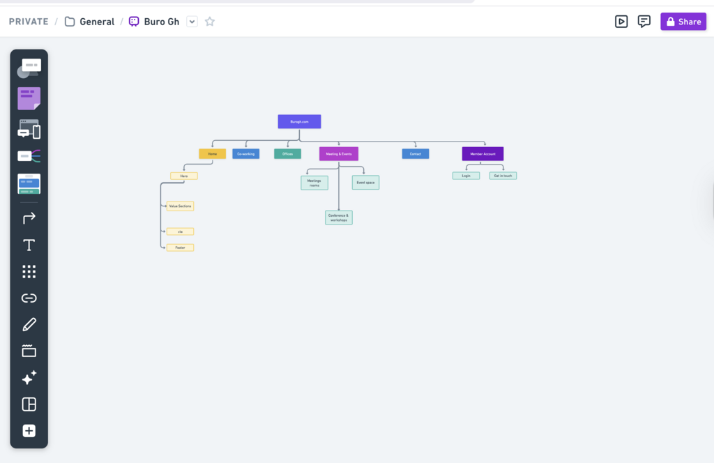
Flow in whimsical
3. Design Exploration
I created multiple homepage concepts, tested messaging approaches, and refined them through bi-weekly reviews with Patrick at Buro.
Design Evolution: Finding the Right Voice
I iterated through three homepage concepts before landing on the final direction:
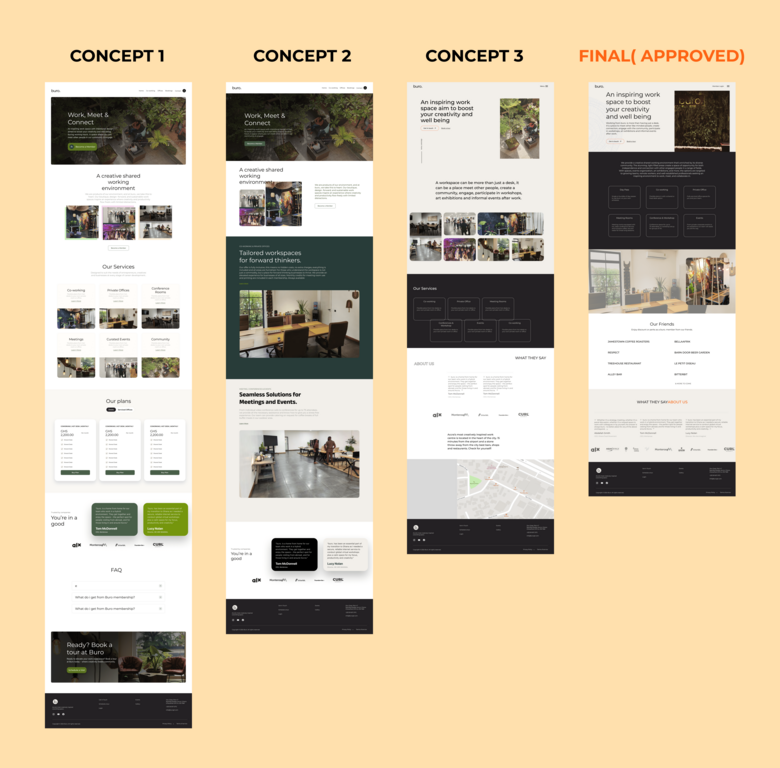
Version 1: "Work, Meet & Connect"
Split-screen hero with aerial photo
- Services grid with bright cards
- Focused on facilities (co-working, private offices, conference rooms, meetings, events, community)
- Feedback: Too transactional, felt like a brochure
Version 2: Same hero, refined services section
Added "Tailored workspaces for forward thinkers" messaging
- Dark green section for differentiation
- Testimonials in dark cards
- Feedback: Better, but still leading with services instead of inspiration
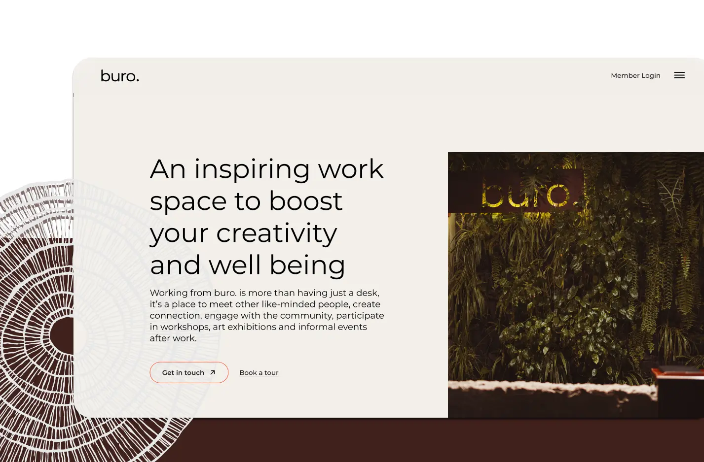
Version 3: "An inspiring work space to boost your creativity and well-being"
Minimal hero with single CTA ("Get In touch")
Minimal hero with single CTA ("Get In touch")
- Photo gallery showing community events
- Services as minimal, outlined cards on a dark background
- "What They Say" testimonials
- Map with location context
- Feedback: Getting closer—more aspirational, but needed refinement
Final Version: "An inspiring work space to boost your creativity and well-being"
- Clean split-screen hero (text + aerial photo with orange accent shape)
- "Working from buro. is more than having just a desk..." storytelling
- Services presented in clean dark sections with icons (Day Pass, Co-working, Private Office, Meeting Rooms, Conference & Workshop, Events)
- "Our Friends" section: Partner businesses offering member discounts (Jamestown Coffee Roasters, Bellafrik, Respect, etc.)
- Testimonials with real names and companies
- Orange accent colour for CTAs and wayfinding
Why this worked: It led with aspiration, told a story about community, and made services discoverable without overwhelming visitors.
Final Solution
I designed a complete site with:
Homepage: Aspirational hero → Community story → Services overview → Partners → Testimonials → CTA
Co-working Page: "Work, Meet & Connect" → How do you like to work? (Day Pass, Hot Desk, Fixed Desk with photos) → Pricing
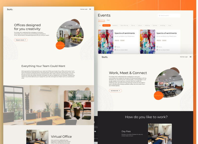
Private Offices: "Offices designed for your creativity" → Everything Your Team Could Want → Virtual Office option → Pricing
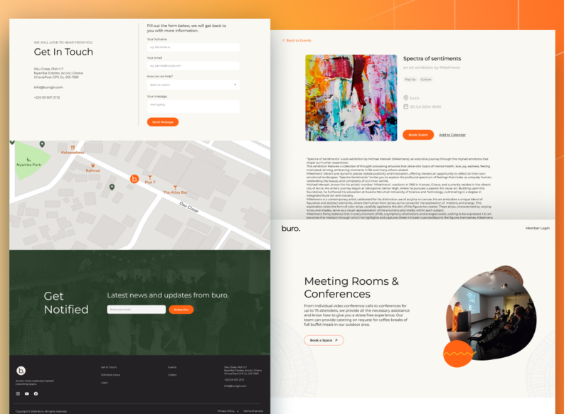
Meeting Rooms & Events: Hero → Event spaces for any need → Visual storytelling with rounded photo frames + orange accents
Events: Filterable grid (Networking, Marketing, Pop-up, Cultural, etc.) → Public access (no login required) → Event detail pages with "Book Event" CTA
Contact: Split layout (Get In Touch form + map) → Newsletter signup → Footer with links
Design Style Guide:
Typography: Buro (custom), Body Inter Text (20-24px Medium)
- Colours: Black, White, Grays, Dark Green (495F4D, 1A2151), Orange accent (F2592F)
- Components: Buttons (primary, secondary), cards, forms, navigation menu
Implementation
I worked as lead and solo designer alongside the Touchstack Technologies engineering team for technical implementation. The site launched at burogh.com after 6 months (with breaks for stakeholder feedback).
Periodic reviews with Patrick at Buro kept the project aligned and allowed for rapid iteration.
Impact
Post-launch results:
Increased bookings across services
- Event discoverability: Visitors can browse events without Nexudus login, making Buro's community visible to prospects
- Clearer service offerings: "Our Friends" partnerships and service options are now prominent
- Premium positioning: Visual design matches Buro's repositioning as Accra's creative workspace
- Patrick's feedback: "They love it, easy to navigate"
What I Learned
Lead with aspiration, not transactions
Early concepts focused on services and pricing. The final design led with inspiration and community—converting better because people buy into why, not just what.
Early concepts focused on services and pricing. The final design led with inspiration and community—converting better because people buy into why, not just what.
Community visibility drives conversions
Making events publicly accessible (without requiring Nexudus login) gave prospects a window into Buro's culture. This was the key differentiator.
Iteration reveals the right voice
Three homepage concepts taught me that finding the right messaging is as important as visual design. "An inspiring work space to boost your creativity and well-being" resonated because it spoke to outcomes, not features.
Three homepage concepts taught me that finding the right messaging is as important as visual design. "An inspiring work space to boost your creativity and well-being" resonated because it spoke to outcomes, not features.
Strategic design repositions brands
This wasn't just a visual refresh—it was a repositioning from a generic co-working space to premium creative community hub. Every design decision (typography, color, photography, messaging) reinforced that shift.
Role: Lead Product Designer
Team: Patrick Gentilezza (Founder), Touchstack Technologies (Engineering)
Timeline: 6 months
Impact: Launched at burogh.com • Increased bookings • Improved discoverability • Premium positioning
Team: Patrick Gentilezza (Founder), Touchstack Technologies (Engineering)
Timeline: 6 months
Impact: Launched at burogh.com • Increased bookings • Improved discoverability • Premium positioning
🤝
Work with me
Let's collaborate to bring your product vision to life with thoughtful design and strategic thinking.
Get in touch