The Challenge In early 2022, I joined a four-person founding team in Finland to launch a B2B SaaS product in just six months—on a shoestring budget. We were building a no-code platform for creating onboarding flows, lead funnels, and interactive forms in a crowded market where existing solutions either cost £4K–£12K in agency work or demanded hours of setup time.
However, a statistic kept me awake: 70–90% of SaaS users abandon products after their initial use because they never grasp the value or understand how to begin. Business owners recognised they had a problem, but the available solutions simply created new ones.
My brief was straightforward: design something non-developers would genuinely want to use. And quickly.
The Real Problem Nobody Was Solving
User research surfaced a universal truth: speed trumps perfection. I spent the first month speaking to over 20 business owners at companies like Hotjar, PagerDuty, TraceGains, and Built by Bright. I wasn't seeking validation—I was searching for the truth.And the truth was stark. marble experiments.png3.22 MB
Everyone expressed the same sentiment in various ways: "I need it fast, not perfect."
They didn't want another tool packed with features they'd never utilise. They wanted to launch an onboarding flow today, not next quarter. They needed their brand colours without having to hire a developer. They required conditional logic to qualify leads, yet the mention of "if/then statements" made their eyes glaze over.
Crucially, everything had to function seamlessly on mobile. Non-negotiable.
The insight became crystal clear: Speed, simplicity, and brand control—all three, together. Nobody in the market was successfully delivering this combination.
That became our guiding principle.
Choosing the Canvas
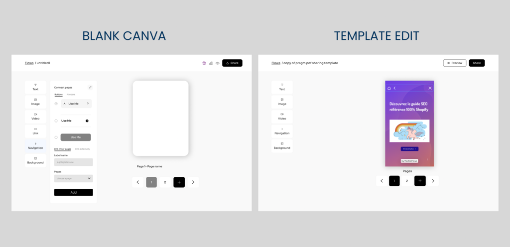
Templates transformed paralysis into momentum. I prototyped two competing approaches: a conventional form-builder (think: add field, configure field, repeat) versus a freeform canvas where users could drag, drop, and arrange elements. BLANK VS TEMPLATE.png263 KB
I presented both to users.
The canvas won. Every single time. It felt faster and more flexible. Less like completing a government document and more like sketching an idea.
But there was a snag. The blank canvas induced paralysis. A classic paradox of choice. Users would open the tool, stare at the white screen, and... stop.
So, we made a crucial pivot: we retained the canvas—but replaced the blank start with curated, opinionated templates that users could customise in mere seconds.
This single decision unlocked everything. Users could immediately see a finished example, understand the design pattern, and then make it their own.
Building the System
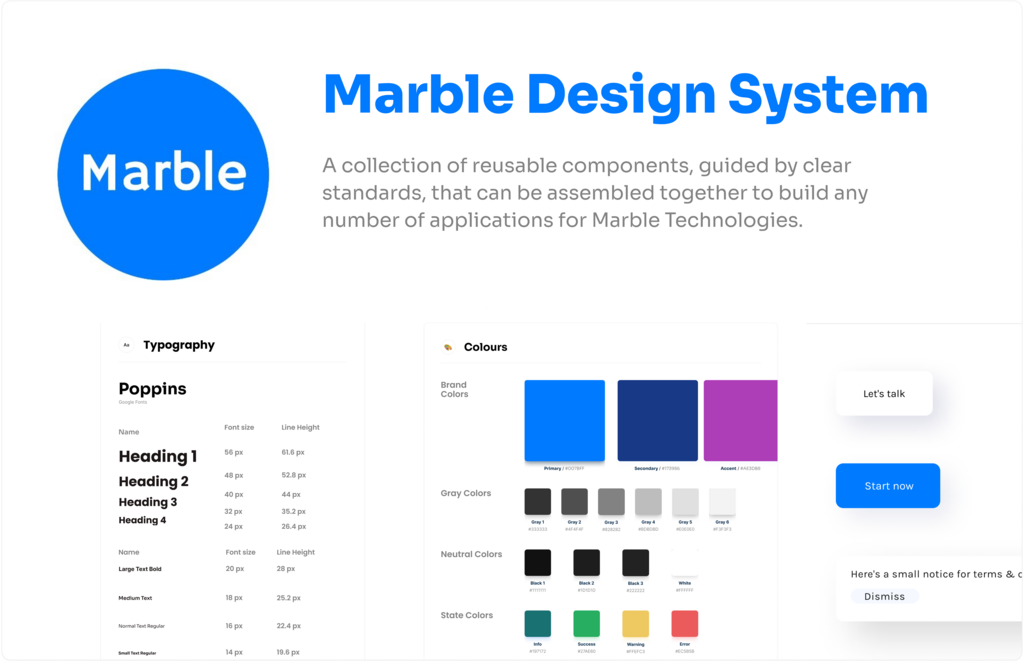
Design systems offer leverage when time is short. Given our constraints—three engineers and tight deadlines—our team couldn't afford design debt or miscommunication. Any conversation that began with "Hold on, that's not what the design showed" was time we simply didn't possess.
I built a comprehensive design system in Figma—reusable components, clear naming conventions, spacing rules, and interaction states. It became our single source of truth. Engineers could pick up what they needed. I could design in parallel. Handoff via Zeplin ensured everyone was synchronised.
MARBLE DESIGN SYS.png1 MB
No need for constant daily check-ins—just a common language and zero ambiguity.
Designing for Speed
Every design decision was filtered through one question: Does this make us faster?
Over the following three months, I designed the core experience around velocity:
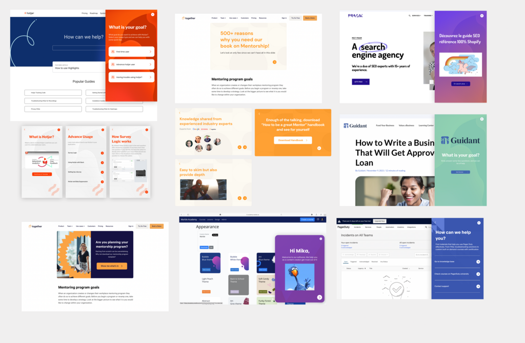
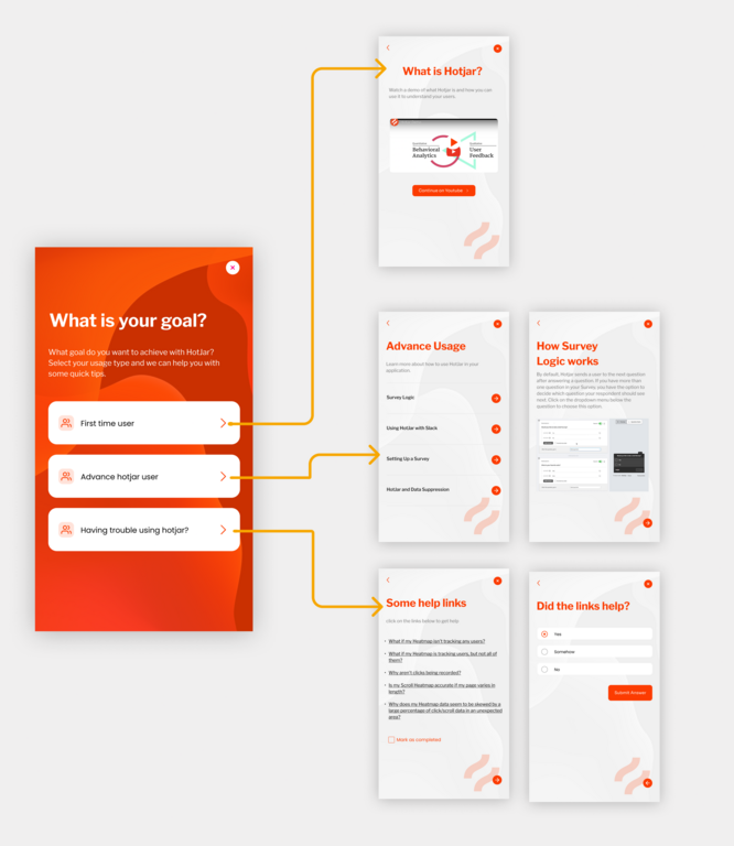
We created 100+ templates organised by use case—lead generation, product onboarding, customer surveys, exit intent pop-ups. Each template was deployable straight away but fully customisable. Brand colours, fonts, spacing, copy—everything could be adjusted without any code.
Marble.png488 KB
Conditional logic was the trickiest challenge. Users needed branching paths (if someone answers X, show them Y), but "conditional logic" sounds like programming. We reframed "if/then" into a connect-the-dots branching model—drag, snap, done. Non-technical users started building complex qualification funnels instantly.To make speed tangible, I used subtle motion and progressive disclosure. Smooth 200-millisecond transitions made the creation process feel fluid, not mechanical. Users described it as "sketching, not configuring." The canvas automatically adapted across desktop, tablet, and mobile, guaranteeing seamless responsiveness.
Conditional logics.png1.16 MB
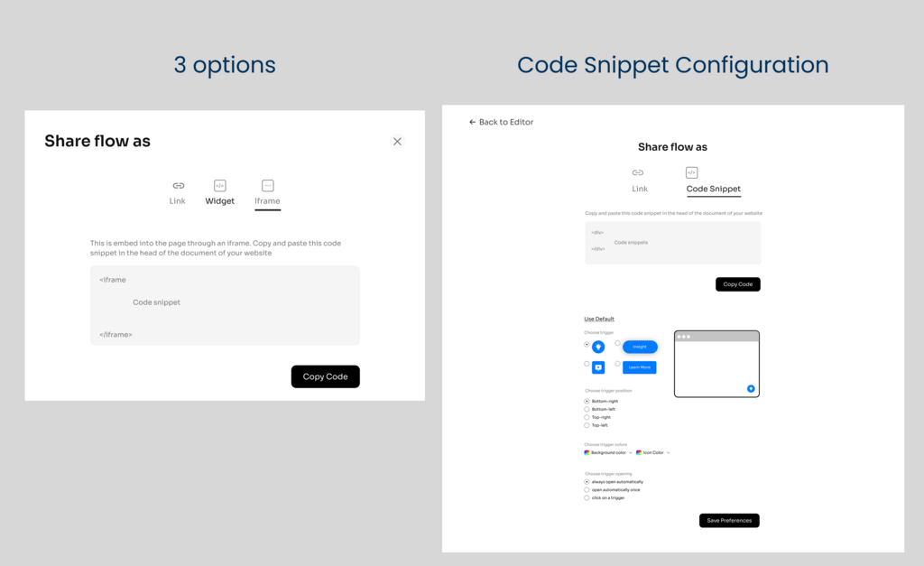
For distribution, I designed three embed options: standalone URL, iframe, or lightweight widget. Connect to your CRM. Built-in A/B testing. Real-time analytics. Because asking "did it work?" shouldn't necessitate stitching together three other tools.
And accessibility wasn't optional. Keyboard navigation throughout. Screen reader support. WCAG AA compliance. Good design works for everyone. We later modified this to allow more preference configuration for code snippets. sharing.png136 KB
Launching Like We Meant It
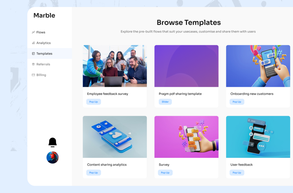
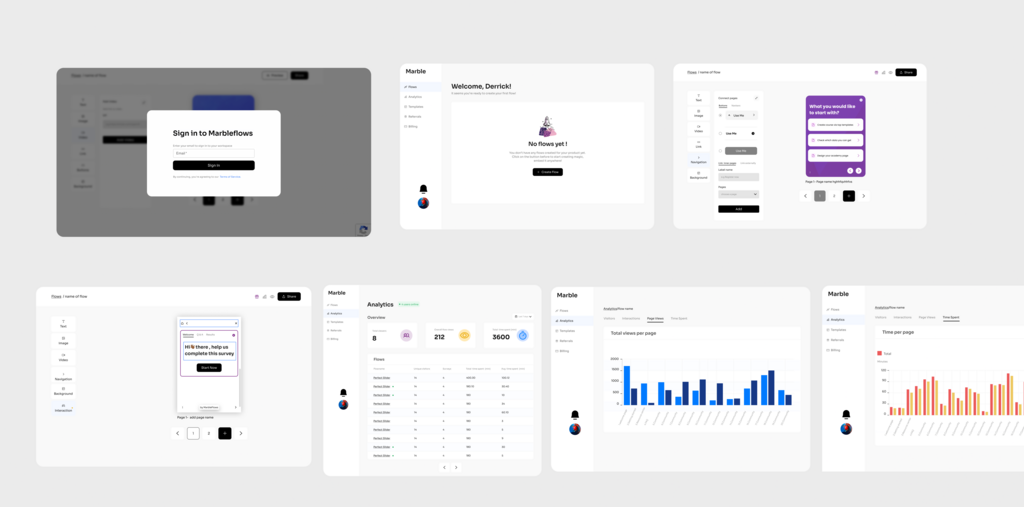
other pages.png1.99 MB
Strategic positioning was a design decision, not a marketing afterthought. With limited resources, our launch strategy had to be surgical. I worked closely with our marketing team—Iuliia Shnai (CEO), Alena Meshcheriakova (CMO), and Sasha (Marketer)—to transform constraints into creative opportunities.
Product Hunt was our focus. Together, we coordinated the timing and strategy. I led the design and messaging, creating all demo assets while the team generated pre-launch excitement that yielded 500 waitlist sign-ups. But the most critical decision was positioning.
We committed to a single promise: the fastest way to build onboarding flows—and eliminated anything that diluted it.
We weren't "the most powerful." We weren't "the cheapest." Every choice was filtered through: does this reinforce speed?
Then came AppSumo. The founding team was doubtful about offering a lifetime deal (£65 vs. £23/month recurring). Wouldn't we be leaving money on the table?
Alena argued strongly in favour of it. Here's why: we needed customers now. We needed validation now. We needed word-of-mouth now. Recurring revenue could wait.
The gamble paid off. We sold over 300 lifetime deals. Instant cash flow. Instant validation. And those customers became our loudest advocates.
This was not merely marketing. This was product strategy. Design dictates how people discover, perceive, and adopt your product. We embraced that reality.
What We Changed & Why It Worked
Launch day was only the beginning. December 22, 2022. We reached No. 1 on Product Hunt, beating over 200 other products.
But the launch is where the true learning starts.
Within weeks, we observed patterns in how people used (and struggled with) the product:
The 15-template-categories problem. Too many choices overwhelmed users. We condensed them to six core categories. Decision fatigue plummeted. Conversions rose.
The "conditional logic is too technical" problem. Even with visual branching, users hesitated. I added inline tooltips with plain-English explanations. Suddenly, non-technical users were building sophisticated funnels.
The clunky canvas resizing problem. I watched session recordings of users struggling with drag handles. We completely rebuilt the interaction.
We shipped quickly. We listened even faster.
The Numbers That Mattered
In the first 60 days:
€18K in revenue (organic growth)
350+ B2B customers from word-of-mouth
67% activation rate—crushing our 40% goal and industry benchmarks
Users created 1,000+ funnels in the first month
4.5+ star ratings across every review platform
The activation rate told the real story. Activation meant signed up and built a live flow—67% did. That's exceptional. That's intentional UX—clean interfaces, reduced friction, and obvious next steps.
The data proved my conviction: better design equals more sign-ups, higher retention, and faster revenue.
Design is not decoration. It is a growth lever.
What I’d Tell My Past Self
Strategy trumps features every time Positioning Marbleflows as "the fastest" wasn't marketing fluff—it was a product filter. Every feature, every flow, every decision was tested against one question: "Does this make us faster?" That singular focus shaped our pricing, go-to-market approach, roadmap priorities, and user perception. Strategic framing matters more than exhaustive feature lists.
Design drives revenue, full stop 67% activation wasn't luck. It was clean UI. Reduced friction. Obvious next steps. The correlation was undeniable: better design = more sign-ups = higher retention = faster revenue. If someone suggests design is subjective, show them the metrics.
Launch timing belongs in the designer’s toolkit Product Hunt wasn't just PR—it was our distribution strategy. Choosing when and how to launch was as important as what we built. Go-to-Market (GTM) strategy isn't someone else's job. As a designer, you influence how people discover and adopt your product. Own that responsibility.
Constraints unlock creativity Templates didn't restrict users—they empowered them. Blank canvases caused paralysis. Structure plus flexibility unlocked speed. The best products remove friction, not freedom—and they do it quickly. That has been my guiding principle ever since.